

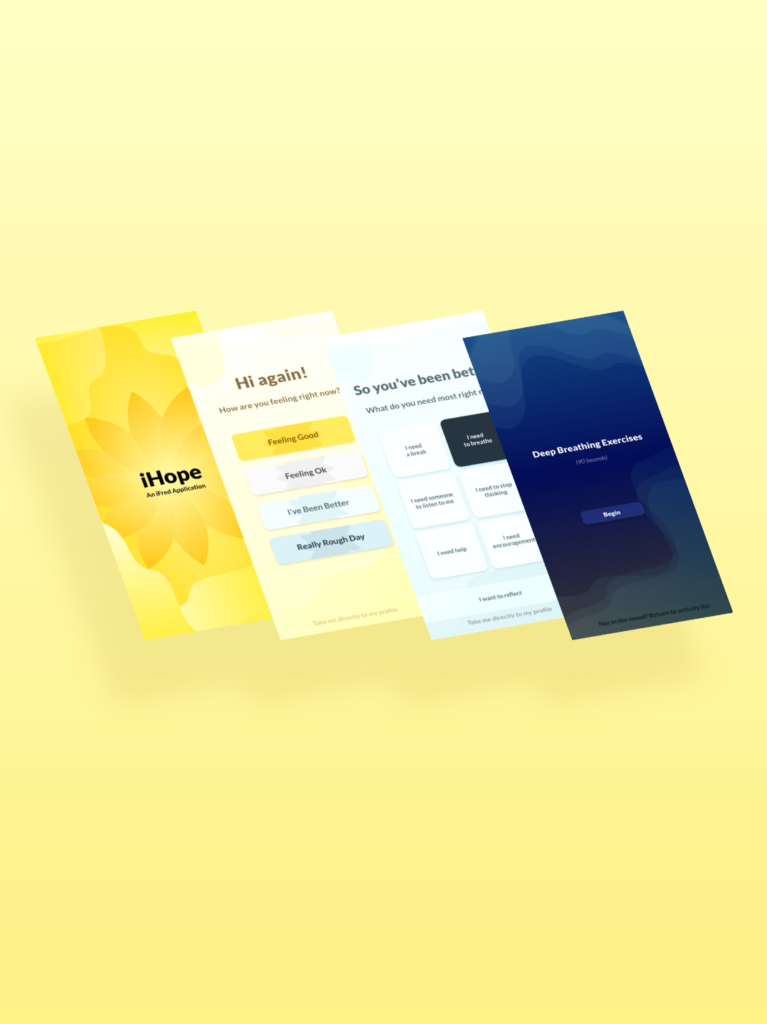
Portfolio Projects
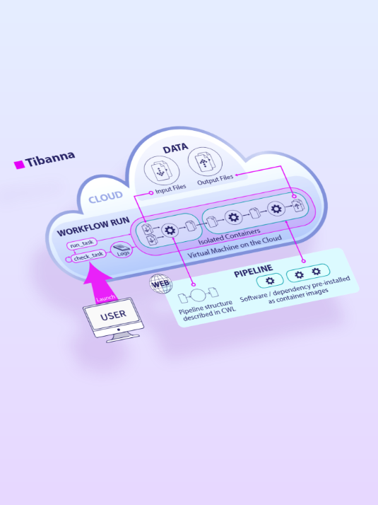
Tibanna
Before The graphic is cluttered and confusing,there is no way to decipher what Tibanna is or what the goal of the product is. How can I Add Value? Spotlight 1. Simplify the color scheme and highlight Tibanna 2. Add unique visual elements to allow the user to differentiate between locations for the files 3. Create
MicroMeta
Before Out of Date & Simple, the interface needed a facelift. How can I Add Value? Spotlight 1. Create a Cohesive Realistic style to the components that users can recognize 2. Simplify the background canvas to allow users to focus on the components and not get lost in visual excess 3. Add clear labels to
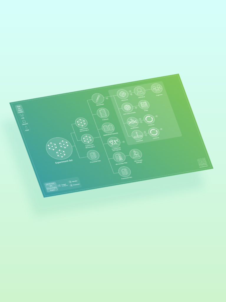
4DN Portal – Redesign
Before This is the infographic the manager at the Data Portal came to me with to update. The Re-design
4DN Portal – Redesign Read More »
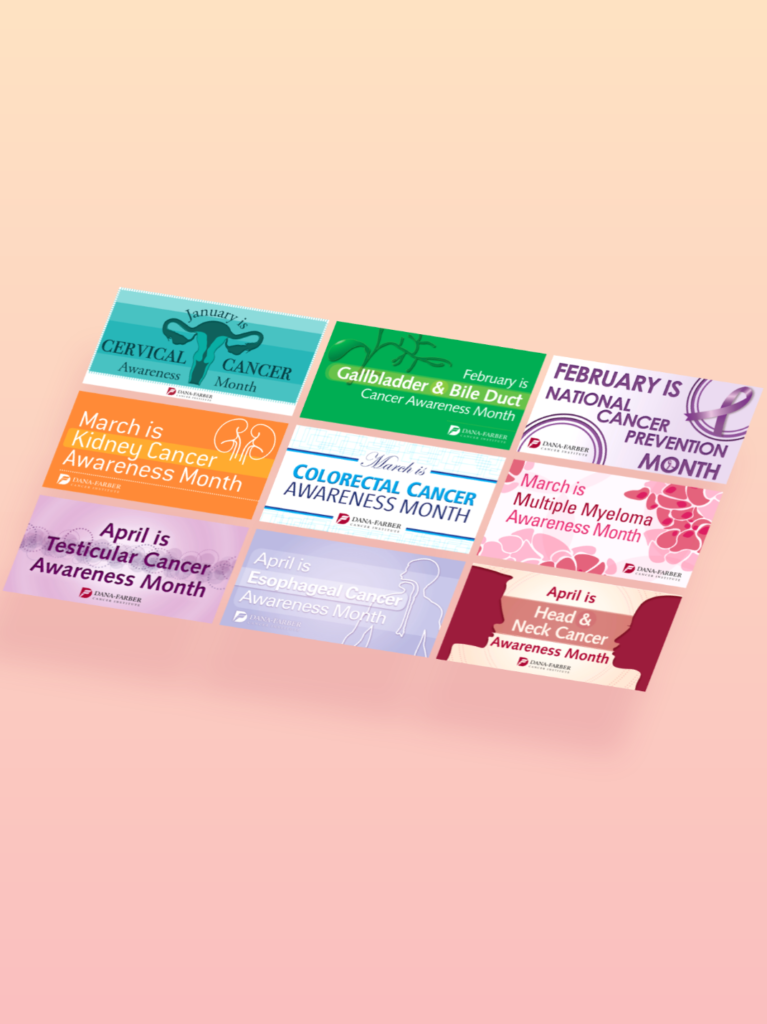
Dana Farber Cancer Institute
Monthly Awareness Graphics Distributed across all DFCI social streams for the months of January – April for Awareness of different cancers. Inside the Institute I was the solo designer for this weekly issue of Inside the Institute, a newspaper that highlights news and events in and around Dana Farber. Well – Being Benefits Fair Banners
Dana Farber Cancer Institute Read More »
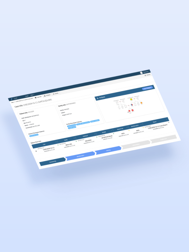
CGAP Portal
Case View: Workflow Below is an example of what a specialized user would encounter on CGAP. We created unique Filtering, Annotation and Pedigree Viewers to help a user work through a genetic case with ease and speed.