Tibanna - Redesign
Graphic Redesign
2019
Client: Harvard Medical School
Role: Graphic Redesign
Team: Solo Designer - Under Project Manager
Background:
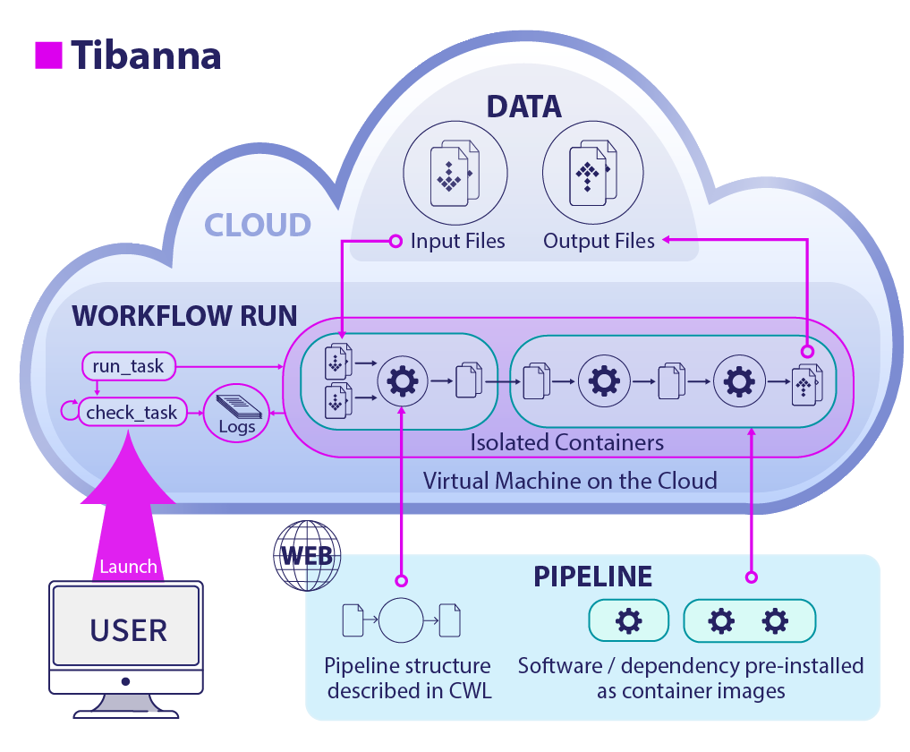
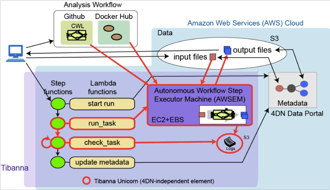
The Tibanna infographic was brought to me by a scientist looking to create a clearer graphic for her paper on a new workflow for files. Her existing graphic was very complicated and only understood by those very familiar with her project. Together we added a visual identity for Tibanna and worked to make it clearer and more visually efficient. The end product shows the impact of design in spreading information and education.
Before
The graphic is cluttered and confusing,
there is no way to decipher what Tibanna is or
what the goal of the product is.

Screen Shot 2021-05-15 at 6.18.08 PM
How can I Add Value?
Spotlight
1. Simplify the color scheme and highlight Tibanna
2. Add unique visual elements to allow the user to differentiate between locations for the files
3. Create a clear label for Tibanna and use arrows to clearly direct the viewer through the pipeline
After: The Redesign